Most end users put little time into thinking about how software design affects their experience of mobile and desktop devices. Attractive, easy-to-use applications achieve their intended effects in that they perform the desired tasks and make individuals’ lives easier, more connected, and more entertaining. However, none of these tools would be possible without constant innovation in software design.
To adapt to the mercurial nature of consumer technology, software design trends are emerging more quickly than ever. Designers work tirelessly to produce new techniques that push the limits of users’ imaginations while keeping companies ahead of their inventive competitors. As a result, brands and consumers alike benefit from better design.
From back-end undertakings to user-facing innovations, 2014 software design trends run the gamut of functional and aesthetic considerations. Read on to learn which techniques to expect to see more of over the next few months.
The Year’s Most Compelling Software Design Trends in 2014, software design trends to watch include:
1. Prototyping apps. This “hot new thing” in software design allows designers to approximate what their end users will experience, from aesthetic to navigational components. Users of these applications, such as InVision, perform design work in the program of their preference. Then they easily transfer it to a mobile or desktop browser.
Prototyping apps present myriad benefits to users, including simpler collaboration, more realistic mockups, comparison analysis with previous versions of pages, and overall ease of use for individuals with varying levels of technical know-how.
2. Physical object integration. Anyone following the technology world is likely familiar with the term “Internet of Things,” which describes the incorporation of items such as phones, medical devices, vehicles, and virtually anything else into a wirelessly-connected environment. Experts expect this development to continue as companies find innovative ways to connect everyday objects with computers and one another using the power of Big Data.
The Internet of Things is not unique in that it combines hardware and software design to achieve a technical goal. However, the onus will be on hardware designers (as well as product designers) to create objects that perform an application’s desired functions.
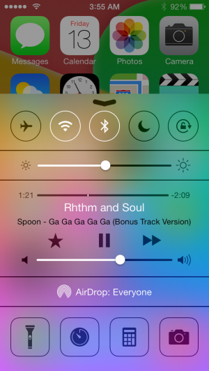
3. Increased use of translucency. Although remaining a point of contention among software designers, translucency appears likely to remain a popular visual tool for the foreseeable future. This approach allows users to view multiple pages or components of their screens simultaneously by layering one over the other.
A common use of translucency is in Apple and Windows Menu bars, which remain available to users while the underlying content stays visible. Some developers argue translucency creates too much “visual clutter,” distracting users rather than improving their productivity.
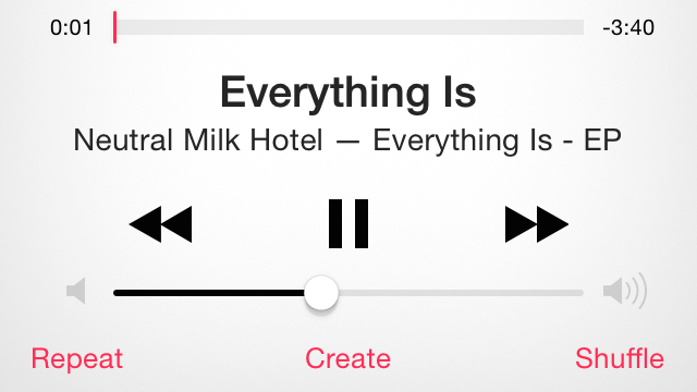
4. Lower content density. This seemingly paradoxical development comes as the amount of content on the internet grows more extensive than ever. Perhaps to lower the visual “noise” for users, software design is facilitating cleaner, simpler interfaces for mobile and desktop users alike.
Applications such as Tweetbot 3.0 and YouTube exemplify this trend towards lower content density. The number of individual content pieces fitting on the screen at any given time has decreased consistently with each version, presenting fewer options to visitors. As long as the available options adequately reflect the interests and needs of users, such simplification may prove beneficial.
5. Buttons masquerading as text. Particularly in mobile environments, the demarcation between text and buttons continues to become increasingly subtle. This allows for greater integration of links with surrounding text, arguably making the overall design of a page more attractive. However, designers must understand the difference between subtlety and perplexity in designing buttons; otherwise mobile users will have trouble determining which text represents buttons and which text is only text.

6. Tiles/cards. From Windows 8 to Pinterest, “live tiles” represent one of the most dynamic aspects of software design in use today. These structures respond to the activities of a user to present tidbits of information – from images to videos to news stories – based on their demonstrated interests. Also referred to as cards, tiles provide timely and relevant tools personalized to each user.
7. Theming applications. From the iPhone 5C Series to Android offerings such as the Moto X, smartphones are beginning to come in a spectrum of colors based on users’ personal tastes. This is creating a need for applications that customize screen color schemes to match phones.
Third-party applications have risen to the occasion, from Dribble’s stark-white aesthetic to the more customizable theming apps such as Tweetbot 3.0 and Fantastical. However, these apps offer limited functionality. Going forward, developers of various types of apps will likely place a greater emphasis on theming based on the colors of users’ phones.
Whether users are seeking greater simplicity of options, more attractive interfaces, or deeper integration of physical objects with their virtual systems, 2014 continues to deliver impactful design solutions. Over the next few months, those paying close attention to the tech industry will continue to be dazzled
Which current software design trends do you find the most compelling or useful?
Main image credit: abduzeedo.com
The post 7 emerging trends in software design appeared first on Technorati.


Get Social